Overhaul of a yogurt producer’s website using their current branding and a refreshed color palette. launch site
Story
St. Benoit Creamery was looking to modernize their brand to appeal to a younger audience while staying true to their organic business agenda. EEBSMEDIA subcontracted me for the design and some minor coding responsibilities.
There were many challenges with the client communicating their vision. These difficulties were solved once they formalized a solid direction.
Assets
All provided by the client to use. Logo was to stay the same, a few shades of green and typography choices were given. A basic, spacious layout was requested with black, white, and green as the only colors.
logo
soleil
grand hotel
colors
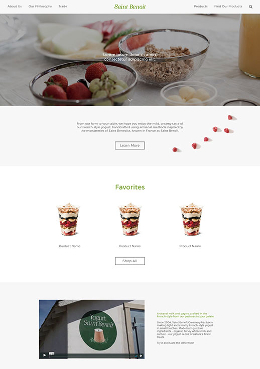
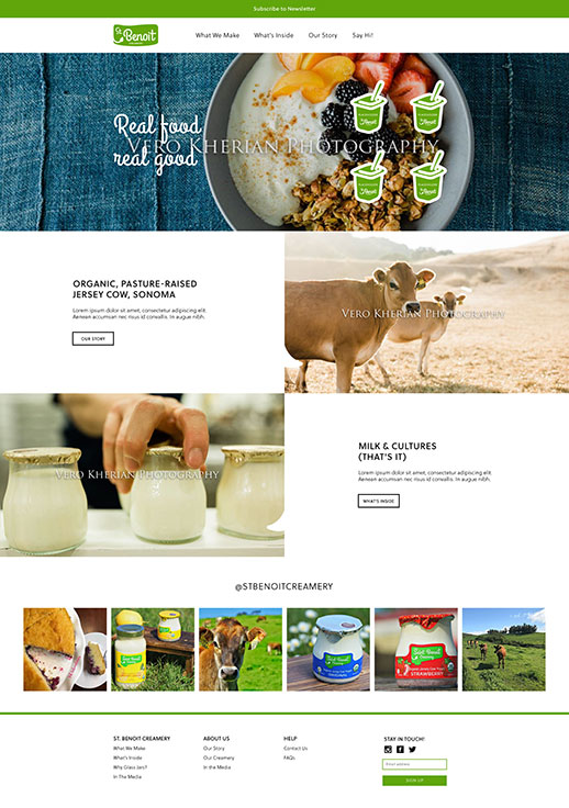
Mockups
Initial mocks were made before I was given any directions and resources. Then after following the client’s requirements, I provided revised finals before proceeding onto coding.
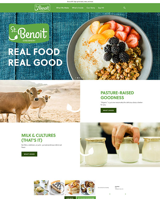
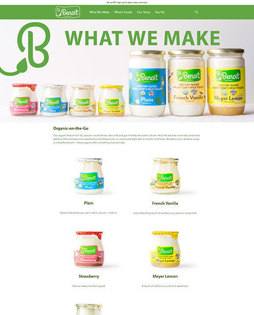
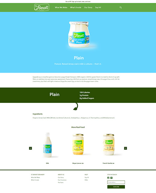
Final Site
St. Benoit Creamery decided to favor mobile first design, hence the basic composition and different typography styling in the live site. Top banner images can be freely changed around along with content. Additionally, font size was
increased and reduced to one style from the initial two.